APP REDESIGN
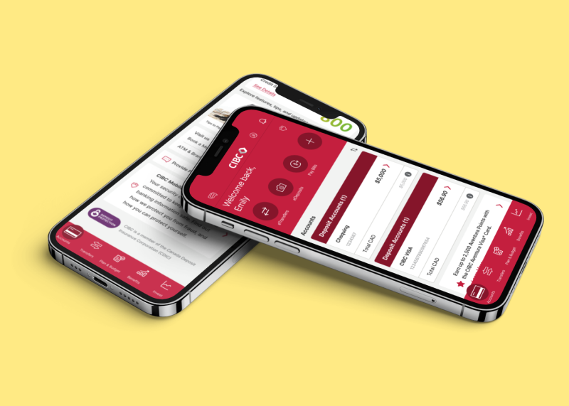
CIBC App
⏳ Project Duration:
2 days, personal project
🧰 Tools:
Figma, Pen and paper
🙋♀️ My Role:
End-to-end Product Designer
CONTEXT
One day as I was checking the cibc app, I noticed parts of the design that could be improved for a better user experience, so I did a quick case study on the landing page.
CHALLENGE
how might we create an easier, more convenient experience for customers?
I thought about what makes a good app and the objectives of a mobile banking app. Ultimately, it’s to create an easy, convenient experience. However, after studying the CIBC app, there were 2 main problems I wanted to solve:
1, the menu is kind of a cognitive overload, there are so many components within it.
2, the app design has less of a consideration for thumb zone, as all of the CTAs are placed at the top and top corners of the screen.
RESEARCH & OPPORTUNITY
Based on a survey by the New Jersey Business & Industry Association, 87% of respondents use their mobile banking app at least once a month, of which 70% of Millennials and Gen X check their credit score at least once a month. This validates the assumption that a consistent amount of users access their mobile banking apps on a regular basis. Therefore, a more straightforward, convenient mobile banking app experience is needed.
INFORMATION ARCHITECTURE
restructuring the site map
After identifying the problem, I listed out all the components of the app and restructured the information architecture, with consideration of a header redesign and new navigation bar.
DESIGN
considering thumb zones
In addition to restructuring the site map to simplify the menu items, I also analyzed the original design and its consideration of thumb zones.
With most CTAs located at the top of the screen, it wasn’t convenient for the user to easily access them, especially with one hand.
FINAL DESIGN
The original design of the landing page affects the ease of use. Once the information architecture was restructured, I started by sketching out a new layout with these updates incorporated into it. I kept the header, but updated the features in it, and added a bottom nav bar that makes navigation easier, whether the user is holding the phone with one or both hands.
Even though these are minor adjustments, it makes a difference for the user experience, and I trust that CIBC would want to make the experience better for their customers.
FINAL PROTOTYPE
TAKEAWAYS
It’s interesting how we get used to how an app works, even if it doesn’t have the best user experience. So, this was a fun project to work on by taking an app that I’ve used for many years, analyzing it, and improving it for a better experience.
Due to the time constraints, I was only able to work on a small portion of the app. Given more time in the future, I would love to continue building on top of this re-design.


