NDA PROJECT
NY-based Social Enterprise
⏳ Project Duration:
8 weeks, ongoing client project
🧰 Tools:
Figma, FigJam, Notion, Pen and paper
🙋♀️ My Role:
Lead UX Designer leading a team of 10+ designers to design a fully-functional, searchable database
CONTEXT
a comprehensive online tool to assist patients through direct support services
The company began as a direct services organization started by a fierce and dedicated mom who was intent on finding secure and dedicated services for her son with special needs. From 2016 - 2021, the company provided a wide array of services across New York City and had a major impact on the local level, but it was clear that seismic shifts were necessary to create systemic change.
With that goal in mind, the company began conceptualizing and developing a series of digital products that would empower patients with the resources and information needed to get the best care in the most efficient manner.
CHALLENGE
improve existing online directory for patients to optimize navigation & support
Work within current design patterns, with research, content and engineering teams to use accessible designs to reach business goals.
While the company is at a startup stage, looking to develop ways to expand the user base by improving and iterating on the general online directory for patients with special needs to more easily and conveniently find specialized resources for themselves.
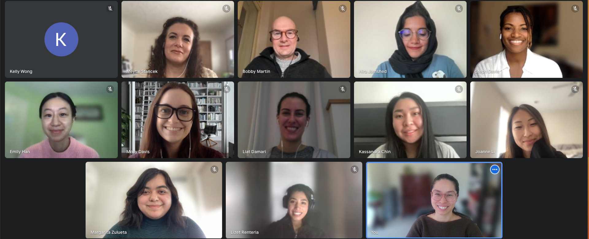
MEET THE TEAM!
PROJECT PROCESS
how i worked with the team
I collaborated with the team in an Agile environment, through an iterative process, and communicated often with other teams - research, content and engineering - to stay up to date with deadlines and progress. All design iterations were based on qualitative analyses and quantitative user research.
how i received feedback
I gave and received feedback within the design team during daily meetings and working sessions, as well as weekly retrospectives. Additionally, each week’s progress was presented at the client demo to the Founder and executives to receive feedback.
RESEARCH
competitive analysis
To start off, we surveyed the industry for common inspiring features in resource guides and health-related websites to engage and support the help-seeking client.
Seeing the process of how a user goes about searching for providers and reviewing whether they are a good fit gave me insight on potential features and screens needed.
USABILITY TESTING - ROUND 1
the 1st round of usability testing targeted the existing design
test objectives
Ease of navigation
Ease of searching for a therapist
Ease of saving a provider/contact
Previous design:
# of users
8 participants who were parents of patients
success metrics
87.5% NPS

how users feel, what users need
The 1st round of usability testing informed us of design validations that we should maintain, as well as pain points that we should improve. We learned about what information that users found important, as well as icons and flows that caused confusion and frustration. Understanding the parents’ needs and current market trends helped us realize that the website resource guide still needed a lot more fine-tuning to improve the overall experience of the product.
Although some insights were less than majority of users, I observed through research on competitors’ websites and noticed that these features were implemented. This solidified the decision for us to find solutions for these insights.
IDEATE - ROUND 1
creative problem-solving and applying the solutions
With the research and test findings on hand, we began making design iterations.
Since there was an existing branding style and color scheme, we utilized the design system and stayed within the guidelines, while adding new features and screens. As changes were later made based on research findings, the design system was updated accordingly.
To adhere to accessibility guidelines, I ensured that elements were checked with contrast checkers, texts were the appropriate line height and spacing, buttons required focus ring states, and more.
While iterating on the designs, we also partnered with the content team to provide feedback on the wording. We continued to make iterations following their suggestions, which were left as comments in our collaborative Figma file.
IDEATE - ROUND 2
3..2..1…pivot!
During the iteration phase, we received new direction from stakeholders to incorporate new features, including a new appointment scheduling feature, into our designs, that were to be presented at a pitch later in the month. The whole team was able to pivot and incorporate these features into the flow and designs under my guidance in a span of only ~1 week.
Based on the additions, I updated the user flow accordingly to stay inline with the designs.
USABILITY TESTING - ROUND 2
testing our solutions and new ideas
Once the 2nd round of iterations were completed, the prototype was handed off to the research team to conduct a 2nd round of usability testing and card sorting. Testing our solutions to the previous user feedback would validate that we made the correct design solutions, while testing new features would provide us with more user insights on how to enhance them. Card sorting would also help us to understand and prioritize the importance of certain categories over others, which would improve the hierarchy of content categories. We scheduled a quick hand-off meeting with them to go over the prototype, communicate what we wanted to be tested and what insights we wanted to understand.
Overall, testing results validated our design decisions and showed an increase in user satisfaction and ease of navigation.
test objectives
Ease of navigation
Ease of searching for a speech therapist
Ease of scheduling an appointment
# of users
5 participants who were parents of patients
success metrics
12.5% increase in NPS
IDEATE - ROUND 3
applying solutions to the designs
The designs and prototype underwent significant revision since the 1st version. The 1st version incorporated desirable features from competitors, but lacked ease of search, particularly in the landing page and results page. This resulted in user confusion due to not knowing the purpose of certain displayed features (tabs, bookmark) and having to click on too many things before finding what they need (filters).
In the updated version, user flow was improved, and priorities and hierarchy were re-evaluated. The landing page now provides the user easy access to resources and allows the user to search for resources based on their insurance/payment information. The results page now provides the user an easier search experience with a single filter modal and map view.
Below are some, but not all, improvements made to the screens, under my guidance.
HAND-OFF
final version: handing off to the engineer
With the deadline nearing, we finally reached the stage to hand the product off to the engineering team. We set up a meeting with the head engineer and went through each annotated screen to ensure we were on the same page with functions and designs.
We worked remotely with our Chilean engineer and communicated through Figma, Slack and Google Meets. Once designs were finalized, we went through the screens and flow together to make sure designs and features were well-communicated and feasible on his end.
TAKEAWAYS
ongoing project & results
This was a great experience working within an agile environment with a team of researchers, copywriters, designers and engineers. Due to the time constraint of 8 weeks, we were only able to iterate and test one part of the resource guide flow. However, at the end of the 8-week Agile framework, we achieved 2 rounds of usability testing, 1 round of preference testing and 1 round of concept testing. The test results informed our final design and feature decisions, and contributed to our 3+ rounds of design iterations.
For the next steps of this ongoing client project, I will test the final prototype with a larger group of users to receive more feedback to continue with iterations. Additionally, I will expand on the flow to include more resources and restructure the information architecture.


